Choosing the right colors for your website goes beyond just picking few favorite colors. Your website colors should match the mood of your site. There should be a balance of colors that please you but also serve your visitors. Using color can be simplified once you know the right steps to take.
The 3-Color Palette
Best practice suggests that it’s best to keep to a 3-color palette for your website (not counting black, grey and white). Adding additional colors may result in a chaotic looking website.
Begin by selecting 2 colors that go well together and then adding a third color as your accent color.
To choose the first two colors, you might start with the colors in your logo if you have one. This will result in consistent branding. If your logo doesn’t have colors or if you don’t have a logo, choosing your website colors will be a little more challenging.
How do you choose appropriate colors?
Colors have a mood
- Warm colors evoke outgoing, energetic and happy feelings
- Cool colors generally have a calming or reserved effect
- Neutral colors don’t evoke much emotion at all
The meaning found in colors
Different colors can have very different meanings. Additionally, shades (colors mixed with black) or tints (colors mixed with white) of one hue (pure color) can totally those meanings. And… the colors you pair them with can also create entirely different moods and meanings.
Choosing your first two colors

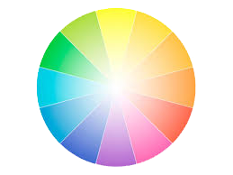
When choosing your first two colors, it’s best to pick colors that are adjacent to each other on the color wheel.
These are called analogous colors. Choosing colors that are a slice or two over from each other will automatically blend well together.
Choosing an accent color
Next, you’ll choose an accent color. This color will add zing to your color palette and should be used in areas you want to draw attention to, such as emphasizing a call-to-action button or a sign-up form.
This color should be brighter, bolder or darker in order to stand out from the first two colors you’ve chosen.
An easy way to choose an accent color is to choose a complimentary color. Complimentary colors are those that are on opposite sides of the color wheel.
Color picking tools
Web Colour Data will give you the hex codes used in any site as well as the colors used on the color wheel so you can see where they are in comparison to each other.
This tool also shows you other sites which use similar colors. Try entering your site in to see what other sites use similar colors and take note of their target audiences.
Another great tool is the Color Wizard. If you have one color that you’re sure you want to use but are challenged with finding complimentary colors, you can enter the color hex code into this tool and discover color schemes based on the parameters you choose.
A note about tints and shades
Once you’ve selected your 3 main colors (3 analogous colors OR 2 analogous colors + 1 complimentary color), you should start using these colors throughout your site.
You may find that you need darker (shades) and lighter (tints) versions of these 3 main colors to create contrast or draw more or less attention to something. It’s okay to play around with the colors until you land on something that strikes your fancy. A caution though not to use too many variations of your 3 main colors or your color scheme may begin to look chaotic.

