With the fast-moving and ever-changing looks seen on the Internet, it is very important to stay current if you want to be on track in the online world. All bloggers and other website owners need to stay current with the latest trends. Website design, including fonts, has always been an important factor that can determine the success of a website.
An important design element on a website includes the choice of fonts. Fonts are a big part of websites as most have a lot of text and need to be appealing to readers. The design is one of the areas where there will always be new trends that change, as there is no design that is the best.
Here are some of the most widely adopted font in the past year.
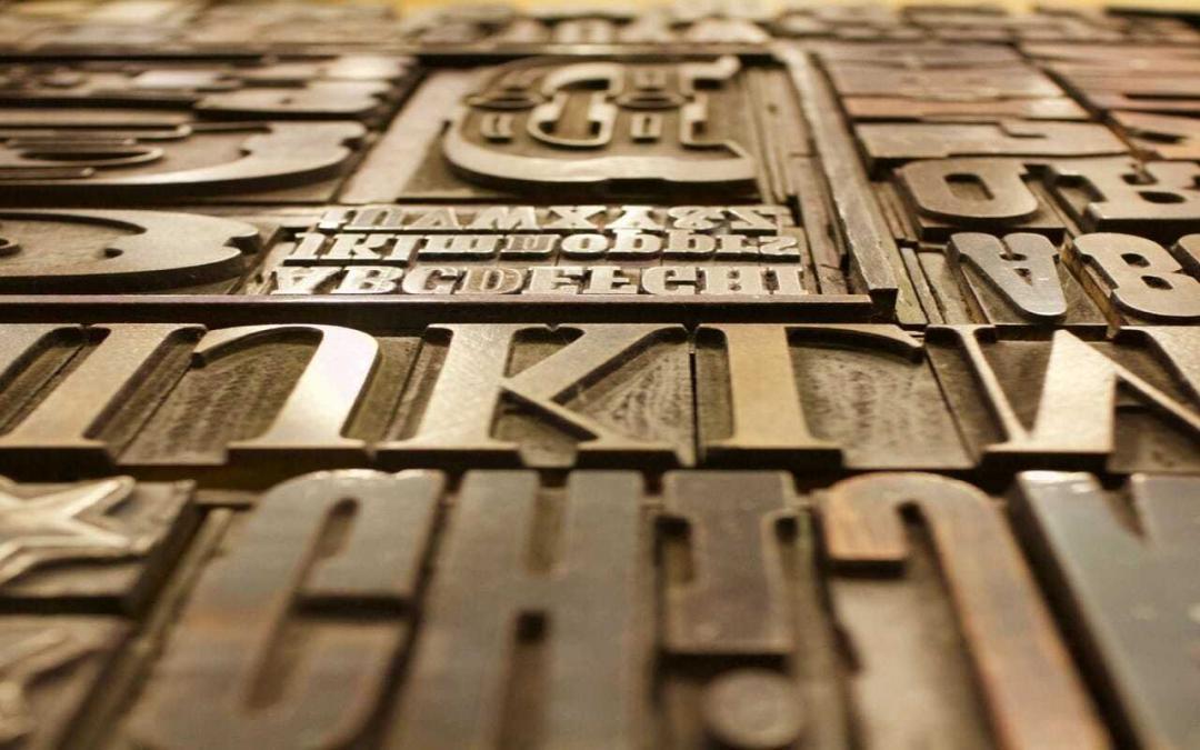
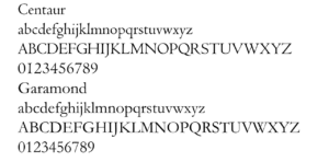
Serif Fonts

Minimalism saw the rise in the use of the sans serif font. Well… it’s time to shift back, hence, the return of the serif font. Blogs and websites will once again have more character, depth, and warmth.
Depending on the design and nature of your website, you can use serif font and combine it with other font styles, such as sans, to bring a more serious, practical, and business tone; or a dual serif if your site is more focused on lifestyle, travel, and leisure.
Variable Fonts
 Technology has always been an important factor in design. People appreciate technology and innovation more than ever and this is why you need to give people great design. A new font, called Open Type is a variable font that can be used for any type of font. Instead of being traditionally static, these fonts gain and lose weight. They are constantly moving and have different types of transformations making it easier to catch a visitors attention when they visit your website.
Helvetica Font
 Helvetica has been used on websites and blogs for what seems like forever and it remains very popular. Helvetica remains one of the most reliable website fonts. This typeface is the most popular font with all designers and this is because it’s good and looks attractive to everyone.
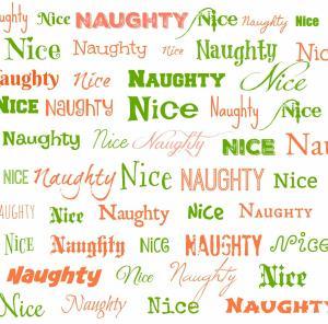
Handwritten Font
Handwritten fonts are coming back strong. We have seen several blogs slowly introducing handwritten fonts to their visitors through titles, headings, subheadings, and quotes.
It appears that such fonts will be more common as time passes by. Yet another opposite of minimalism is the introduction of big, bolded layouts in combination with handwriting. The big white space is still preserved but only now you can find big bolded headings, with handwritten elements underneath to complement them. Pretty cool stuff here.
Geometric Fonts
 Geometric typefaces bring something completely fresh to the table and this is noticeable at first sight. This is why Geometric typefaces have been growing in popularity ever since they emerged a year or so ago. These letterforms don’t have serifs. They are designed with the combination of clean geometrically perfect circles and straight lines. They have a really modern look and can be used for branding.